Design Principles - Exercises
13/04/2020 - 08/05/2020 (Week 1 - Week 4 )
Avery Ong Xuan Ting ( 0344462 )
Design Principles / Bachelor of Design ( Hons ) in Creative Multimedia
Task 1 / Exercises
INSTRUCTIONS
LECTURES
Week 5:
-Symbol A sign, shape, or object that is used to represent something else. In design, symbols can provide or convey information, equivalent to one or more sentences of text, or even a whole story.
- PICTORIAL SYMBOLS Image-related and simplified pictures.
- ABSTRACT SYMBOLS Can look like the objects that they represent but have less details.(ABSTRACT there is different from abstract art.)

http://katielily.wordpress.com/2010/10/30/logos-cont/
- Imagery is a vital part of design, be it print or digital. Users and viewers are able to relate to a concept or a brand if the right images are used in a work of design. It is therefore important to use suitable and relevant images when designing.
Pinterest
https://inspiredology.com/examples-of-typographic-portraits/
TASK 5
Exercise ( Week 5 )
Design an arbitrary symbol and write a 20-to 50-word rationale for the final design. Create a design that has a combination of imagery and typography. If you are using photographs, they must be of your own. Each outcome to be in A4 size. Remember to explore various ideas before deciding on a final idea.
SYMBOL
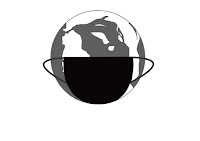
I designed two arbitrary symbol. Both of the idea is to advice everyone in the world to take action to the Covid-19 pandemic. Nowadays, Most of the western countries still lack of ' discipline ' in Covid-19 battle. So I designed these two symbol by Photoshop, our earth is wearing a mask and hand gloves with a smiling face ( fig.1 ) and a simple green world wearing a mask ( fig.2 ) to advice everyone to prevent the spread of Covid-19.
fig.1
fig.2
Lecturer's Feedback :Both of them were not an Arbitrary symbol. It was more like a combination of Abstract and Pictorial symbol. I can use this idea to design another Arbitrary symbol and send to the lecturer to check again.

fig.3
final outcome
Rationale :
Finally, I clearly understood what actually Arbitrary Symbol is. As my rationale of this design, my favourite element shapes are triangle. I tried to combine some triangle shapes together and fix them to looks nicer. The purpose of this design is to be more self-confidence. Because I always feel myself inferior so I combined my favourite element shapes together like composing the favourite part of me to build up my confident.
IMAGERY
Progress :
I look back my gallery to find some photograph taken by me to done this artwork because we can't go outside during quarantine. As a result, I found two image that I think it suit the quotes I search from Google, which is :
- You can't see the glory of life, if you haven't seen the dark side of life. -- Bessel van der Kolk
- Don't let today's disappointment cast a shadow on tomorrow's.
fig.3 ; Istanbul ; 18/12/2019
fig.4 ; Melaka ; 5/4/2019
I added some warm effect for the image to make it more suitable to the quotes. After editing the text into the image, I also changed their typeface.
fig.3 ; outcome
fig.4 ; outcome
Lecture's Feedback :
I should understand the meaning of quotes before editing the image. However, not everything from online was correct, the phrases of fig.4 were incomplete. I could remove the 's of the last word (tomorrow) and do more exploration. Write down the name, year and where I took the image.
final outcome ; Istanbul ; 18/12/2019
final outcome ; Melaka ; 5/4/2019
TYPOGRAPHY
I was trying to explore more but I had no idea about typography. So I continued my idea of the symbol , the Covid-19.
fig.5
I try to design the earth using typography but I don't think this really relate to the design principle. So I designed another artwork.
fig.6
I used the word ' EARTH ' to convey the meaning of the words.
Lecture's Feedback :
The design was not represented very well. It was very complicated. Maybe I can just use the word to produce its outline and do more exploration.
final outcome
I don't think if the outline was designed by the word ' Earth ' will works well. So I type the word at the middle and edit like its watermark as my final outcome. I think it looks better.
LECTURES
Week 4:
- Harmony involves the selection of elements that share a common trait. It becomes monotony without variety.
- Unity occurs when these elements are composed in such a way that they are balanced and give a sense of oneness, creating a theme.

https://idesign.news/2018/01/26/the-importance-of-harmony-and-unity-in-interior-design/
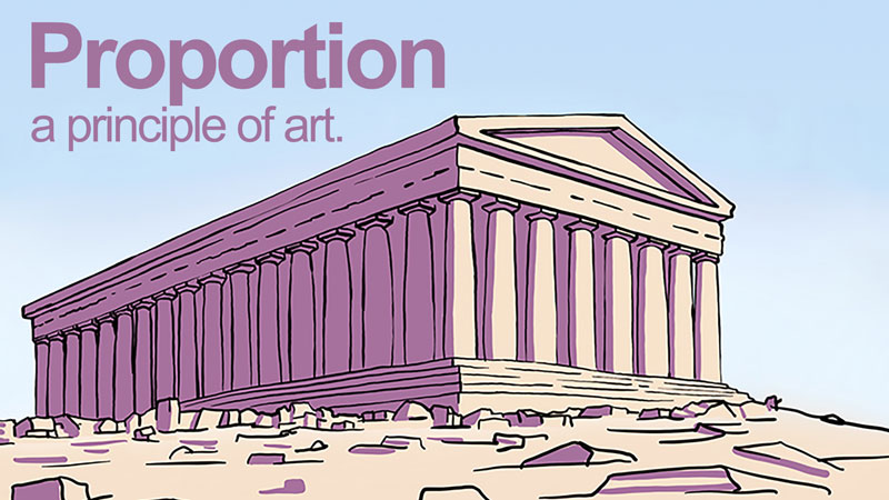
- Proportion is the relationship of two or more elements in a design and how they compare with one another. The effective use of proportion in design often results in harmony and unity.

https://thevirtualinstructor.com/blog/proportion-a-principle-of-art
TASK 4
Exercise ( Week 4 )
HARMONY and UNITY
second outcome ; way to Fuji Mount.
third outcome ; sunset
Research :
Pinterest
After doing many research, I still not really sure what Harmony and Unity means. I have try many artwork using phone and Photoshop's brush tool because I didn't have those required materials.
Inspiration :
New Zealand ; 22/11/2018
I review back my Gallery to find some inspiration. As a result, I found a picture I took in New Zealand few years ago.
Progress :
first outcome
After this, I had tried many artwork with natural scenery . But I'm not really sure it's related to harmony , unity or harmony and unity.
second outcome ; way to Fuji Mount.
third outcome ; sunset
forth outcome ; Reflection of a mountain
For the last artwork, I drew a light house in morning view and evening view. It shows out a different tone.
fifth outcome
Lecture's Feedback :
All of my artwork reflected to Unity and Harmony design principle.
- Forth outcome : Should give more spaces for the landscape to make it more balanced and harmonious. It didn't really shows out the reflection due to it's colour and format.
- Fifth outcome : Morning view was more interesting than the evening view because of the sky's tone.
forth outcome ( final )
I edited the forth design according to lecture's feedback. However, I think it looks better now and shows out the reflection clearly. These art had a same tone and similar shapes. The main colour is purple, from dark to light like to show the harmony.
LECTURES
Week 3:
- Repetition could make a work of design seem active. The repetition of elements of design creates rhythm and pattern within the work.

artranked.com
- Movement in a visual image comes from the kinds of shapes, forms, lines, and curves that are used.

Wordpress.com
- Hierarchy is the choreography of content in a composition to communicate information and convey meaning. Visual hierarchy directs viewers to the most important information first, and identifies navigation through secondary content.
- Alignment is the placement of elements in a way that edges line up along common rows or columns, or their bodies along a common center. Alignment creates a sense of unity and cohesion, which contributes to the design's overall aesthetic and perceived stability.

Pinterest
TASK 3
Exercise ( Week 3 )
For this week exercise, we have to produce a design of Repetition and Movement using watercolour and pastels. Although we have learned Hierarchy and Alignment for this week, but is not necessary to produce both of these design unless I want to do more exploration.
REPETITION
I have no idea for this design principle at first. So I tried to draw many circle and combine all together with different colour. I used computer to draw because I don't have the required materials for this week.
Progress :
first outcome
It looks like a colourful fish scale but I think it's too simple. So I tried to use this artwork to do more exploration.
second outcome
I draw an air-balloon and used the first outcome as its design. After I've done this artwork, I think it's a little bit childish. So I tried to figure another idea for this design.
third outcome
I draw a betta fish and coloured it with the first artwork. But i'm not sure is this reflected Repetition design principle.
Lecture's Feedback :
Replace other colour for the black outline rather than only using black. Try to use this idea to show more attempts.
forth outcome
I tried to change the black colour outline to dark pink which was more matched to the colour of the fish. I think its look more flow and better now.
final outcome
MOVEMENT
Research :
Pinterest
Reference :
Progress :
I love to dance. So I imitate a sketch like the reference I found using colour pencil . But I'm not good at drawing.
sketch
After sketching, I used brush to draw out the outcome in photoshop. But I'm not sure is the haze in this art really reflect to Movement.
first outcome
Lecture's Feedback:
The human figure was too heavy, use a lighter colour for the human or only an outline. Try to draw different angle and give more space for the side because it was quite box up.
final outcome
I added some movement for the human and changed the colour to purple to match the haze tone. I've draw the human size smaller to give more spaces for the landscape. Other than that, I set against a light background for the art to summit the design principle.
LECTURES
Week 2 :
- Emphasis is defined as an area or object within the artwork that draws attention and becomes a focal point.
- Subordination is defined as minimizing or toning down other compositional elements in order to bring attention to the focal point.
- Focal point refers to an area in the composition that has the most significance, an area that the artist wants to draw attention to as the most important aspect.
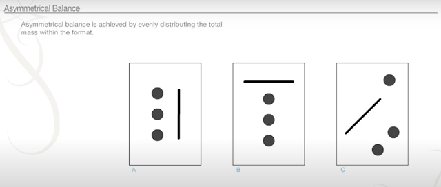
Balance is the distribution of the visual weight of objects, colors, texture, and space. If the design was a scale, these elements should be balanced to make a design feel stable.
- Symmetrical balance , the elements used on one side of the design are similar to those on the other side ;

TASK 2
Exercise ( Week 2 )
For this week exercise is to produce a design of Emphasis and Balance design principles using pen, pencil and marker pen. The artwork can be colourful or black and white.
EMPHASIS
by Kenia Berganza ; Pinterest
Progress :
My most favourite cartoon is Winnie the Pooh which created by an English author A.A. Milne. So I tried to sketch many Poohs as subordination with a Piglet to draws attention and becomes a focal point.
My most favourite cartoon is Winnie the Pooh which created by an English author A.A. Milne. So I tried to sketch many Poohs as subordination with a Piglet to draws attention and becomes a focal point.
sketch 1
There are 35 poohs in this sketch but they were not balance. Some are big and some are small. So I tried to make them all same size.
sketch 2
I used black pen to draw its outline and colour them with colour pencil.
first outcome
Lecture's Feedback :
This wasn't emphasis design principle. Ms. Jinchi suggested only choose Pooh or Piglet as subordination but in a darker tone or colour and smaller size. Draw a bigger Pooh or Piglet with a lighter colour as the focal point.
This wasn't emphasis design principle. Ms. Jinchi suggested only choose Pooh or Piglet as subordination but in a darker tone or colour and smaller size. Draw a bigger Pooh or Piglet with a lighter colour as the focal point.
final outcome
After discuss with lecturer, I choose to rework my pooh to smaller size and different tone. There are 44 little poohs . I draw a original pooh and bigger size as the focal point in the middle.
BALANCE
After researching, I decided to use black and white to express the balance. It really needs a lot of time to draw this artwork. The material I had used were pencil , Marker pen and pen.
Progress :
I get this idea from Henna , a form of body art originating in ancient India. I split it into half with a line in the middle, one side is black and another side is white to reflect balance.
sketch 1
sketch 2
first outcome
Lecture's Feedback :
Draw a full circle and keep everything in the middle. Either horizontal or vertical line will be better.
Draw a full circle and keep everything in the middle. Either horizontal or vertical line will be better.
final outcome
After the discussion, I rework into a vertical line and draw a whole circle in the middle.
LECTURES
Week 1 : The elements of visual design include line, shape, form, size, space, colour, value and texture.
Principles of design can be thought of as what we do to the elements of design. If the elements are the ingredients, the principles are the recipe for a good work of design. How the principles of design are applied determines how successful one is in creating a work of design.
TASK 1
Exercise ( Week 1 ) :
Each week's topic involves 2-3 design principles so we have to produce a design in A4 size for each of those design principles. For each exercise, all our progress, research, idea exploration, feedback from lecturers, self-written reflection and final design outcome must be uploaded onto our e-blog. For this week exercises, we were told to do Gestalt and Contrast with black paper, white paper and glue.
CONTRAST
Contrast occurs when two elements on a page are different. Because I only have limited black paper, so I tried my best to use as least as possible. Some little black part I used Chinese black ink to cover because I don't have black marker either.Progress :
This is my DIY bookmark that made of Maple Leaf which I brought back from a vacation few years ago. So I tried to cut out some shape of maple leaf with white and black paper.
first outcome ; A4 size
Lecture's Feedback :
Need to improve to make it a better contrast work. My black box in the middle was not balanced with the random placement of the leaves and visually confusing . So I tried to make it better.
final outcome
I created another piece of contrast work to have another alternative.
Inspiration :
Pinterest
sketch
Lecture's Feedback :
Try more black and white in between if I want to explore more.
Try more black and white in between if I want to explore more.
GESTALT
The Gestalt Principles are a set of laws arising from 1920s’ psychology, describing how humans typically see objects by grouping similar elements, recognizing patterns and simplifying complex images.Progress :
After doing many research from Google and Pinterest for few days. I finally have some idea for GESTALT.
fig. 1 ; sketch
I have sketch some ideas on a recycle paper because I really have no idea with Gestalt at first. So I search some examples from Pinterest and watch some videos on Youtube. As the following materials is black and white papers, the only cute animals I figured out with black and white colours is Panda. So I tried to sketch out a simple Panda without using a lot of black paper.
fig.2 ; by phone
final outcome ; A4 size
Lecture's Feedback :
This Gestalt artwork is too common. So I tried to design another one again.
Reference :
Pinterest
This picture is design by an unknown artist. I found this in Pinterest when I'm doing some research.
so I tried to sketch out an outwork that reflects to figure-ground principles.
final outcome
The white side is a female ; black side is a male. It's a simple art but I used long time to done this artwork.


Comments
Post a Comment