Typography / Exercises

17/04/2020 - 08/05/2020 / Week 1 - Week 4
Typography / Bachelor of Design (Hons) in Creative Multimedia
Exercises / Type Expression & Type Formatting
LECTURERS
Week 1 / Introduction and Briefing :
For the first week of the class, we had some basic introduction of Typography and how to open a blog for every courses that need to use. Mr. Vinod had randomly choose some people's mistake of their blog as example and explained the MIB for the future weeks exercises in details.
For the first week of the class, we had some basic introduction of Typography and how to open a blog for every courses that need to use. Mr. Vinod had randomly choose some people's mistake of their blog as example and explained the MIB for the future weeks exercises in details.
Week 2 / Development :
The video Mr. Vinod posted for this week was the topic of typographic development .
Initially writing meant scratching into wet clay with sharpened stick or carving into stone with a chisel.
 4th century B.C.E. - Phoenician votive stele Carthage, Tunisia. The stole bears a four-line inscription to Tanit and Baal Hammon. Left. Evolution from Phoenician letter.
Phoenicians wrote from right to left. The Greek developed a style writing called 'boustrophedon' which meant that the lines of text read alternately from right to left and left to right. They also changed the orientation of the letterforms.

Etruscan carvers working in marble painted letterforms before inscribing them.


Some example of text type classification:


Week 3 / Text ( Part 1 ) :
- Kerning refers to the automatic of space between letters. Letterspacing means to add space between the letters. The addition and removal of space in a word or sentences is referred to as tracking.
The video Mr. Vinod posted for this week was the topic of typographic development .
Initially writing meant scratching into wet clay with sharpened stick or carving into stone with a chisel.

Phoenicians wrote from right to left. The Greek developed a style writing called 'boustrophedon' which meant that the lines of text read alternately from right to left and left to right. They also changed the orientation of the letterforms.

Etruscan carvers working in marble painted letterforms before inscribing them.

Early letterform development : Phoenician to Roman

Some example of text type classification:


- Kerning refers to the automatic of space between letters. Letterspacing means to add space between the letters. The addition and removal of space in a word or sentences is referred to as tracking.

- Flush left most closely mirrors the asymmetrical experience of handwriting. Each line starts at the same point but ends wherever the last word on the line ends.
- Centered imposes symmetry upon the text, assigning equal value and weight to both ends of any line. Not advisable to use except for small amount of text.
- Flush right places emphasis on the end of a line as opposed to its start. It can be useful in situation like captions and not too big amount of text.
- Justified is like centering, imposes a symmetrical shape on the text. It is achieved by expanding or reducing spaces between words and sometimes, between letters.
Quite simply if you see the type before you see the words, change the type.
- Type size: Text type should be large enough to be read easily at arms length. ( between 8-12 characters )
- Leading: Text that is set too loosely creates striped patterns that distract the reader from the material at hand. ( between 2.5-3 characters )
- Line length: Shorter lines require less leading; longer lines more. A good rule of thumb is to keep line length between 55-65 characters.
Week 4 / Basic :

- Ligature : The character formed by the combination of two or more letterforms.

- Swash : The flourist that extends the stroke of the letterform. Never use swashes and capital letters together to form a word or a name.

To work successfully with type, you should make sure that you are working with a full font and you should know how to use it.
- Uppercase : Capital letters, including certain accented vowels, the cedilla and n tilde and the a/e and o/e ligatures.
- Lowercase : include the same characters as uppercase.
- Small Capitals : Uppercase letterforms draw to the x-height of the typeface. Small caps are primarity found in serif fonts as part of what is often called expert set.

- Punctuation, miscellaneous characters :

Although all fonts contain standard punctuation marks, miscellaneous characters can change from typeface. It's important to be acquainted with all the characters available in a typeface before you choose the appropriate type for a particular job.
- Ornaments :

Used as flourishes in invitations or certificates. They usually are provided as a font in a larger typeface family. Only a few traditional or classical typefaces contain ornamental fonts as part of the entire typeface family.
9 typefaces for this semester :

INSTRUCTIONS
Task 1:
Exercise ( Week 1 )
For the first week exercises, we were asked to express the following six words typographically :
- LOUD
- DROWN
- DISSAPEAR
- PUSH
- FLY
- HIDDEN , KILL or LOVE
We should only use the 9 type families provided to express the meaning of the words. We had to identify the appropriate typeface before sketching ideas out for each word and digitize the artwork in illustrator.
My Sketch :

fig 1.1 ; loud & fly

fig 1.2 ; drown & dissapear

fig 1.3 ; push & kill
I added some graphic designs in some words to express their meaning but Mr. Shamsul said this exercise was not allowed to add graphical element. After some changes, I digitized the artwork in illustrator.

fig. 1.4 ; first outcome
After getting the feedback from Mr. Vinod and Mr. Shamsul, I rework some parts from my first outcome which they suggested to be better.

fig. 1.5 ; final outcome ; JPEG
fig. 1.6 ; final outcome ; PDF
Task 2:
Exercise ( Week 2 )
Choose a word from the six digitized artwork to animate the typography using Photoshop and Illustrator. The word I choose for this exercise was DISSAPEAR.

fig. 2.1 ; progress 1 ; Illustrator
I created 20 frames for the animation in Illustrator.

fig. 2.2 ; progress 2 ; Photoshop

fig. 2.3 ; final outcome ; GIF
fig. 2.4 ; final outcome ; PDF
Task 3:
Exercise ( Week 3 )
Watch the YouTube's video and follow the instruction for the Formatting Text Task.
- Choose one typeface that suit your personality.
- Design 4 different layouts and formatting text.
- Write an 100-200 words content about yourself.

fig. 3.0 ; 9 typrefaces

fig. 3.1 ; Univers LT Std
I only use my first two name because I think my full name is too long. I chose Univers LT Std because it looks thin and tidy.

fig. 3.2 ; progress1 ; normal

fig. 3.3 ; progress2 ; preview

fig. 3.4 ; progress3
Final Outcome :

fig. 3.5 ; preview 1

fig. 3.6 ; preview 2
Task 4:
Exercise ( Week 4 )


- Use the content about yourself and paste it into the page. Create point size, line length and leadings.

- Upload image in a box and copy the same text to fit the columns.

- Choose one favourite typefaces and create your own grid and headline. I chose Univers LT Std typeface for this layout, 4 Margins and Columns and 8 Grids.


After getting feedback from lecturer, I have edited all the problem they had mentioned.


FEEDBACK
Week 1 :
Specific feedback:
- Pay attention with the feedback they given to us individually .
- Sketches we uploaded must make sure that its gradient and lightning is even.
General feedback:
- Remove the chopper from the word KILL to be more interesting.
- The word PUSH have to center it in the box and the outline in the base was too thick.
- Idea of FLY and DROWN didn't really expressed the words.
- Change the typeface of LOUD to express it better.
Week 2 :
Specific feedback:
- Well done to the animation exercise. No changes to be made.
General feedback:
- No feedback given due to public holiday.
Week 3 :
Specific feedback:
- Overall was good. Just keep improving the type formatting exercises.
General feedback:
- Had to show out the letter spacing and choice of type.
- It was too pixilated.
- The layout are too roughly.
Week 4 :
Specific feedback:
- Watch the video again and take down important notes so I won't miss any steps.
- Check every steps after watching the video.
General feedback:
- Business card had too much kerning.
- Need more letterspacing for the words.
- Edit all the paragraph spacing to 15 point.
REFLECTIONS
Week 1 :
Experience: We have learned to open an e-blog for our courses and do some exercises.
Observations: It's a little bit difficult to concentrate during the class for 6 hours. Other than that, My English still not good enough and sometimes I'll misunderstand some words.
Findings: Mr. Vinod had told us to jot down some notes during the class. It's a good suggestion for us to stay concentrate.
Week 2 :
Experience: It's not easy to create a perfect artwork. We have to be very concentrate during the class so that we won't miss any important information.
Observations: We need to design and sketched very carefully to fully express the words. It is important to make sure that the picture of sketches have a perfect lightning without any shadows.
Findings: After reworking and editing my artwork many times, finally it present a better work expression. So I can continue with the next exercises.
Week 3 :
Experience: We don't have class for this week because it's labour day. So we have to watch our lecture class and task video which posted in Facebook and do it by our own.
Observations: The task is not very difficult if we watched the video carefully.
Findings: Self-discipline is very important. Check all the Facebook group post when there are any notifications so we won't miss any exercises.
Week 4 :
Experience: Follow the instruction given by Mr. Vinod to do our task 3 exercise during the class.
Observations: Have to be very concentrate and jot down all the important notes to done the exercise so we won't miss any steps.
Findings: This task was not difficult because Mr. Vinod explained and gave us the instruction step by step very clearly. Follow the video given to done the exercise.
Week 5 :
Experience: This week have a very bad network connection. I keep on disconnected from the meeting during the class. My Indesign app had problem while lecturers were giving my feedbacks. It solved after I reopen the app again.
Observations:Take down the notes while learning new things so we can check back the exercises and steps. Be concentrate during the class.
Findings: Glad that there are a live video at Facebook so we can rewind back any parts we have missed.
FURTHER READING
Week 1 : Hand-Lettering Ledger ( by Mary Kate McDevitt )

Simon Garfield takes a lighthearted approach to the historical aspects of typefaces, which is immensely helpful to beginners & type nerds alike. He also examines our reactions to fonts, which was the most important part of the book for me. It's one thing to learn about the rules of typography and what makes excellent form; it's another thing to learn about how people can react to it since that has a direct relation to how well a font may perform for the designer. Having insight into how people may react and the feeling that the font imparts are crucial to the design and execution process. Being able to predict reactions helps to make decisions with the font design, as well. As I'm sure many font designers will attest, there are multiple versions and revisions of every single letterform before the final version is settled upon.
I typically go through revision after revision before settling upon the final forms. A good example with one of my own releases is Spring Market, which is my best-seller! I knew that I wanted to design a rustic serif font, but needed to consider how people may perceive the overall aesthetic. I needed to ensure that Spring Market was both farmhouse chic and modern. I could envision this font being used in branding projects and rustic wedding invitations, so I had to make decisions based on perception to strike that balance.
Exercise ( Week 4 )
Follow the live video in Facebook group and continue task 3 exercise.
- Download the envelop template from Facebook group and paste the business card we have done last week.

fig. 4.0 ; preview 1
- Create 3 shuffle pages of Guides and Margins and Columns.

fig. 4.1 ;normal view

fig. 4.2 ; preview 2 ; 4 columns

fig. 4.3 ; preview 3 ; 3 columns
- Choose one favourite typefaces and create your own grid and headline. I chose Univers LT Std typeface for this layout, 4 Margins and Columns and 8 Grids.

fig. 4.4 ; normal view

fig. 4.5 ; Final Outcome ; preview

fig. 4.6 ; Final Outcome ; preview 1

fig. 4.7 ; Final Outcome ; preview 2

fig. 4.8 ; Final Outcome ; preview 3

fig. 4.9 ; Final Outcome ; preview 4

fig. 4.10 ; Final Outcome ; preview 5

fig. 4.11 ; Final Outcome ; preview 6
fig. 4.12 ; Final Outcome ; PDF
FEEDBACK
Week 1 :
Specific feedback:
- Pay attention with the feedback they given to us individually .
- Sketches we uploaded must make sure that its gradient and lightning is even.
General feedback:
- Remove the chopper from the word KILL to be more interesting.
- The word PUSH have to center it in the box and the outline in the base was too thick.
- Idea of FLY and DROWN didn't really expressed the words.
- Change the typeface of LOUD to express it better.
Week 2 :
Specific feedback:
- Well done to the animation exercise. No changes to be made.
General feedback:
- No feedback given due to public holiday.
Week 3 :
Specific feedback:
- Overall was good. Just keep improving the type formatting exercises.
General feedback:
- Had to show out the letter spacing and choice of type.
- It was too pixilated.
- The layout are too roughly.
Week 4 :
Specific feedback:
- Watch the video again and take down important notes so I won't miss any steps.
- Check every steps after watching the video.
General feedback:
- Business card had too much kerning.
- Need more letterspacing for the words.
- Edit all the paragraph spacing to 15 point.
REFLECTIONS
Week 1 :
Experience: We have learned to open an e-blog for our courses and do some exercises.
Observations: It's a little bit difficult to concentrate during the class for 6 hours. Other than that, My English still not good enough and sometimes I'll misunderstand some words.
Findings: Mr. Vinod had told us to jot down some notes during the class. It's a good suggestion for us to stay concentrate.
Week 2 :
Experience: It's not easy to create a perfect artwork. We have to be very concentrate during the class so that we won't miss any important information.
Observations: We need to design and sketched very carefully to fully express the words. It is important to make sure that the picture of sketches have a perfect lightning without any shadows.
Findings: After reworking and editing my artwork many times, finally it present a better work expression. So I can continue with the next exercises.
Week 3 :
Experience: We don't have class for this week because it's labour day. So we have to watch our lecture class and task video which posted in Facebook and do it by our own.
Observations: The task is not very difficult if we watched the video carefully.
Findings: Self-discipline is very important. Check all the Facebook group post when there are any notifications so we won't miss any exercises.
Week 4 :
Experience: Follow the instruction given by Mr. Vinod to do our task 3 exercise during the class.
Observations: Have to be very concentrate and jot down all the important notes to done the exercise so we won't miss any steps.
Findings: This task was not difficult because Mr. Vinod explained and gave us the instruction step by step very clearly. Follow the video given to done the exercise.
Week 5 :
Experience: This week have a very bad network connection. I keep on disconnected from the meeting during the class. My Indesign app had problem while lecturers were giving my feedbacks. It solved after I reopen the app again.
Observations:Take down the notes while learning new things so we can check back the exercises and steps. Be concentrate during the class.
Findings: Glad that there are a live video at Facebook so we can rewind back any parts we have missed.
FURTHER READING
Week 1 : Hand-Lettering Ledger ( by Mary Kate McDevitt )

This is a ultimate book for designers and creatives looking to tap into the trend of hand-drawn lettering, this workbook features step-by-step lessons on a range of styles plus more than 120 practice pages, making it the ideal place to learn and perfect this in-demand design skill.
This is just one of my favorite inspirational hand lettering books. There are many out there — this one just happens to be a favorite as I love its style. A warning, though, that the bulk of the book is ‘practical pages’ - pages that are left blank or with instruction for you to do your own doodles/lettering. I did love this though as it can be a little keepsake once you have done your artwork in it. The first bit of the book contains a lovely treasure trove of example lettering and tips and tricks for letterers. It also gives tips on how to digitize your lettering. It's just beautifully presented and is worthy of being part of an inspiring type book collection.
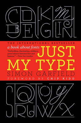
Week 2 : Just My Type: A Book About Fonts ( by Simon Garfield )
Simon Garfield takes a lighthearted approach to the historical aspects of typefaces, which is immensely helpful to beginners & type nerds alike. He also examines our reactions to fonts, which was the most important part of the book for me. It's one thing to learn about the rules of typography and what makes excellent form; it's another thing to learn about how people can react to it since that has a direct relation to how well a font may perform for the designer. Having insight into how people may react and the feeling that the font imparts are crucial to the design and execution process. Being able to predict reactions helps to make decisions with the font design, as well. As I'm sure many font designers will attest, there are multiple versions and revisions of every single letterform before the final version is settled upon.
I typically go through revision after revision before settling upon the final forms. A good example with one of my own releases is Spring Market, which is my best-seller! I knew that I wanted to design a rustic serif font, but needed to consider how people may perceive the overall aesthetic. I needed to ensure that Spring Market was both farmhouse chic and modern. I could envision this font being used in branding projects and rustic wedding invitations, so I had to make decisions based on perception to strike that balance.
Week 3 : Typography Sketchbooks ( by Steven Heller & Lita Talarico )

The very best book out there for people interested in the expressive quality of letters and words and the power of typography and lettering in visual communication is Typography Sketchbooks, edited by Steven Heller and Lita Talarico (Princeton Architectural Press, 2011). It's a tour of the sketchbooks of more than 100 influential type designers and hand letterers; if it doesn't leave you inspired, I don't know that anything will.
Typography the design of letters is at the heart of visual communication and graphic design. No design is successful without successful typography.The result of these wide-ranging typographic musings provide fascinating insights into the expressive quality of letters and words. Aimed at all those who use type, whether by hand or on screen, this pleasing compendium stresses the importance of good typography at a time when reading habits are changing and celebrates a craft that has endured for centuries.
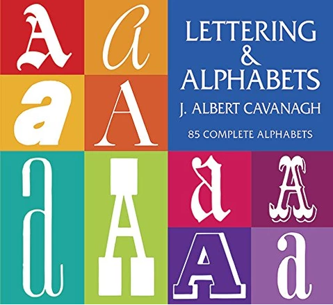
Week 4 : Lettering and Alphabets: 85 Complete Alphabets ( by J. Albert Cavanagh )
Here is a practical book that not only teaches a full course in professional lettering but also contains dozens of hand-lettered alphabets that may be reproduced without cost or permission.
This volume is particularly valuable to beginners who want to get a job with an advertising agency, publisher, or commercial art studio. The author begins his text with discussions of such fundamentals as the correct pencil grip and how to transfer corrected letters from tracing paper to layout. Step-by-step instructions include spacing letters and giving them an individual character, filling in headlines quickly on rough layouts, condensing lettering, and working with brushes, leading up to full descriptions of Garamond, Caslon, Bodini, Formal Script, Barnum, and many other useful lettering styles. All of this is made clear and graphic with the author's own illustrations.
Used as a swipe file for lettering material for ads, trademark designs, monograms, and other commercial work, or as an instruction book in the art of lettering, this book will prove both a time saver and a money saver for any artist.


Comments
Post a Comment