Typography / Project 1
15/5/2020 - 22/5/2020 / Week 5 - Week 6
Avery Ong Xuan Ting / 0344462
Typography / Bachelor of Design (Hons) in Creative Multimedia
Project 1 / Text Formatting and Expression
LECTURES
Week 5 / Project Briefing :
In this first project, we have to express typographically the content in the link provided in a 2-page editorial spread. No images are allowed. However some very minor graphical elements might be allowed. We may use Adobe Illustrator to create headline expression but the final layout is to be completed in Adobe InDesign.
Week 6 / Understanding :
- The uppercase letter forms below suggest symmetry, but in fact it is not symmetrical. Each bracket connecting the serif to the stem has a unique arc.
- The complexity of each individual letterform is neatly demonstrated by examining the lowercase 'a' of two seemingly similar sans serif typefaces-- Helvetica and Univers.
INSTRUCTION
Project 1 ( Week 5 )
I chose ' First Things First Manifesto 2000 ' for my content because I think this would be more interesting for me. I had do some research before starting to sketch. It is a magazine launched in 1999 and published in 1964 by a British designer. The manifesto was subsequently published in many other magazines and books around the world, sometimes in translation.

fig 1.1

fig 1.2
I started to do some roughly sketching after research. First, I designed some expression for the headline.
I pasted the headline first and tried to fix them looks more tidy. Then , I put all the text into the layout and check whether it will present better a not. The typeface I've chosen was Univers LT Std because this is my favourite typeface family between all of the 10 typefaces given and its looks very tidy. But the word ' things ' of the headline is Bodoni Std .
However, I tried to paste in all the text but there were not enough spaces for me and it looks very untidy. So I tried to fix up the text to fit the whole pages, using only 10 pt as the font size.
After adjusting everything, I don't think this design really perform well. So I tried to redesign another layout.
After adjusting and redesigning, I think this work was more excited for me. As a result, this was my first outcome.
fig. 1.3 ; headline
I sketched four different layout but I was not very excited with any of my sketches. However, I tried to choose one that seems like nicest. So I chose the forth sketch to continue the formatting text in InDesign.
fig. 1.4 ; content
fig. 1.5 ; margins and columns
I created 6 margins and columns, and 4 guides. After this, I started to copy and paste all the text given into the layout with the design I had chosen.
fig. 1.6 ; progress
I pasted the headline first and tried to fix them looks more tidy. Then , I put all the text into the layout and check whether it will present better a not. The typeface I've chosen was Univers LT Std because this is my favourite typeface family between all of the 10 typefaces given and its looks very tidy. But the word ' things ' of the headline is Bodoni Std .
fig. 1.7 ; preview
However, I tried to paste in all the text but there were not enough spaces for me and it looks very untidy. So I tried to fix up the text to fit the whole pages, using only 10 pt as the font size.
fig. 1.8 ; first outcome
fig. 1.9 ; first outcome ; preview
fig. 1.8 ; preview
After adjusting and redesigning, I think this work was more excited for me. As a result, this was my first outcome.
first outcome ; JPEG
After getting feedback from Mr. Vinod, I redesigned a new outcome that showed out more expression for the headline.
second outcome ; JPEG
Mr. Vinod said this layout was good but the expression idea of the headline was weak because it was quite similar to the demo he given. So I had to tried another idea again. He also advised me try not to use condense typeface unless I think it's readable. But I'm excited with it because my font size is 12 pt. As a result, this is my final outcome.
final outcome ; preview
final outcome ; JPEG
final outcome ; PDF
FEEDBACK
Week 5 :
Specific feedback:
- No feedback given.
General feedback:
- no feedback given.
Week 6 :
Specific feedback:
- No feedback given.
General feedback:
- no feedback given.
Week 6 :
Specific feedback:
- Nice looking expression but no idea for the headline. Redesign the headline again to show more expression.
- Names and Subtext need to be cross a line.
- Names and Subtext need to be cross a line.
General Feedback:
- The word ' we ' is not necessary to make it Bold Condensed, just make it Bold is enough if I want to.
- Be very careful when using condensed for the typeface.
REFLECTION
Experiences: After the project briefing, I thought I can handle it very well. I have lots of idea to do this project at first. But during the progress, I found that it was not easy to done a good and neat layout. I faces difficulties with the headline expression and idea.
Observation: I observed that how InDesign works for the typography designer. I didn't heard InDesign before learning Formatting Text Exercise. However, I still have to get more familiar with this Adobe apps.
Findings: Throughout this project I found that it was not easy to design a type expression and a neat layout. The typefaces, font size, leading and etc. are very important through every design. I have to be very careful and check whether it's readable a not while using condense for the typeface.
FURTHER READING
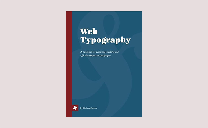
Week 5 : Web Typography ( by Richard Rutter )

It is more informative, less snarky, and equally timeless. Web Typography is the most comprehensive, understandable, and eloquent introduction to typographic design.
In addition to explaining the fundamentals of typographic design, Rutter’s book philosophically embraces the Web’s constraints and freedoms, explaining how to work with rather than against them. Although it is tailored to the Web as a (fluid, changeable, cross-platform) medium and describes implementation of its typographic guidance in terms of CSS syntax, the focus is primarily on teaching good design—both in terms of output and in terms of approach—rather than on the technology for implementing it.
Many books claim to be an “instant classic”; Rutter’s Web Typography fulfills its definition. It is highly recommend to anyone working with CSS, for this is the guidebook that the CSS3 Fonts and CSS3 Text specifications have always wanted. For the Web is one of the primary mediums for text in the modern world, and Rutter explains not only how to set type for the Web, but how to think about typography in its context.
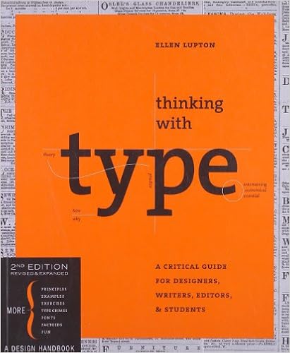
Week 6 : Thinking with Type ( by Ellen Lupton )

The entire book talks both about things that happened in history and things that people do in typography. "In fifteenth-century Italy, humanist writers and scholars rejected gothic scripts in favor of the lettera antica, a classical mode of handwriting with wider, more open forms. The preference for lettera antica was part of the Renaissance (rebirth) of classical art and literature."
Including the parts where they talk about how typography is used. They say stuff, and you're left wondering how any of it works or why it's significant. The author will tell you that some people use a certain grid system and show you a picture of said grid system. But they won't say why those people do it, or what the benefits and disadvantages are of that system compared to others. It's just like "Hey, this grid system exists, see look." This means there is very little practical information in the book.
Week 6 : Thinking with Type ( by Ellen Lupton )

Including the parts where they talk about how typography is used. They say stuff, and you're left wondering how any of it works or why it's significant. The author will tell you that some people use a certain grid system and show you a picture of said grid system. But they won't say why those people do it, or what the benefits and disadvantages are of that system compared to others. It's just like "Hey, this grid system exists, see look." This means there is very little practical information in the book.


Comments
Post a Comment