Typography / Project 2a
29/5/2020 - 5/6/2020 / Week 7 - Week 8
Avery Ong Xuan Ting / 0344462
Typography / Bachelor of Design (Hons) in Creative Multimedia
Project 2a / Font Design
LECTURES
Week 7 / Project Briefing :
Design a limited number of western alphabets. Choose an existing font design that adheres to the
direction to head in. Study the font carefully by analyzing its anatomical parts. Start with rough sketches and upon approval begin digitization of the drawings—software for digitization shall be determined in class. Artworks shall be printed out for critique sessions followed by refinements. If time permits we shall generate the font for actual use. Create a typeface that has the hallmarks of a good typeface; subtlety, character, presence, legibility and readability.
Letters to design: a i m e p y t g d o b ! , .
Week 8 / Transfer Letter from Illustrator to FontLab :
We downloaded FontLab by following the instruction posted in Facebook group. Afterward, Mr. Vinod taught us how to use FontLab and transfer the letters from Illustrator. We should only start digitizing in FontLab after the work in Illustrator had been proved.
Week 9 / Typography in Different Mediums :
- Type for screen
Typefaces for use on the web are optimized and often modified to enhance readability and performance onscreen in a variety of digital environments.
Another important adjustment - especially for typefaces intended for smaller size - is more open spacing.
- Hyperactive Link / hyperlink
is a word, phrase or image that you can click on to jump to a new document or a new section within the current document.
- Font size for screen
16-pixels text on a screen is about the same size as text printed in a book or magazine; this is accounting for reading distance.
- System font for screen / Web Safe Fonts
- Pixel Differential Between Devices
the text on screen differs in proportion because they have different sized pixels. Even within a single device class there will be a lot of variation.
- Static Vs Motion
Static typography has minimal characteristic in expressing words but not necessary.
Motion typography offer typographers opportunities to 'dramatize' type, for letterforms to become 'fluid' and 'kinetic'.
INSTRUCTION
Project 2 ( Week 7 )
Letter Study :
Before we start our project 2 , we were asked to pick one of our favourite font designs out of the 10 typefaces given by the lecturer to study and analyze the letter typeface through dissection by using Illustrator . Therefore, I chose Univers LT Std which is my most favourite typeface for the letter typeface analysis.
We created three 1100pt x 1100pt artboard to analyze the letters O, H, and D by drawing the guideline. I chose to dissection them in uppercase.
fig.2.0 ; Dissection of the letter 'O'
fig.2.1 ; Dissection of the letter 'H'
fig.2.2 ; Dissection of the letter 'D'
Sketches :
After the letter study, we started to do a roughly sketch of our design. We have to produce 3-5 sketches of O,H,D and chose one more word from the words given to design. The last word I chose is the letter 'A'.
fig. 2.3 ; sketches
Digitization:
After my sketches were approved, I started to digitized the font I chosen in Illustrator. I chose the first design to go on because it looks more neatly than others. First, I created fourteen 1100pt x 1100pt new artboard for each letter.
fig. 2.4 ; 14 artboard ( 1100pt x 1100pt )
I decided to digitize those letters in uppercase. Below is the first outcome I tried to design out from Illustrator. Most of the tool I used to design were rectangular tool, pen tool, scissors and pathfinder.

fig.2.8 ; reference

fig. 2.9 ; second outcome
fig. 2.5 ; first outcome with guideline
fig. 2.6 ; first outcome
According to the feedback Mr.Vinod given, I had edited the thin line to 15 point and created a small rectangle ( 30pt x 20pt ) to adjust all the spaces between the strokes and the thin line are the same.
fig. 2.7 ; an example while editing the space
The letter B I had designed doesn't correct. Therefore, I type out 18 Bs with different typeface as a reference to check which part do I need to improve and make it right.

fig.2.8 ; reference
After adjusting the problem, below is my second outcome. Although this design was quite simple compare with others, but I think it looks very neat so I was happy with it.

fig. 2.9 ; second outcome
I sent this outcome to Mr. Vinod again to check. However, these outcome still need a little adjustment. The crotch of the B was too close. Other than that, the letter O and G should make its top and bottom wider.
fig. 2.10; improvement of G, B and D
After finalizing the font design, I measured the dimension of the font, which are Ascender line ( 743 pt ) , Cap line ( 720 pt ) , Median line ( 500 pt ) , Baseline ( 0 pt ) and Descender line ( - 190 pt ) .
fig. 2.11 ; measurement
I generate all the font to outline as a preparation work before I import these letters into FontLab Studio. While joining all the shapes together, I found that lines couldn't work with pathfinder. Meanwhile, I have to reedit all the lines into shape to joint each outline together. This really took a lot of work and time.
fig. 2.19 ; generated font ; Shade.ttf
fig. 2.12 ; outline combination
FontLab Studio:
After creating the outline and joined them together. We started to import the fonts into FontLab Studio. First, key in the dimensions' value that we have measure in Illustrator.
fig. 2.13 ; set the dimensions
Next, click on the keyboard cell to edit the font into the window. I copied each letter's outline which created in Illustrator and pasted into the editing window.
fig. 2.14 ; keyboard cell
Double click the glyph on the keyboard cell and copy and paste the letter in it. After that, adjust and fit the dimension. The shortcut key in editing window are X= zoom out / Z = zoom in .
fig. 2.15 ; adjusting in the editing window
I opened the new metric window to do the letter kerning to ensure the spaces between each letters look equal. I set the value of 50 for the left and right side space for each font. The value for kerning of each font I had set are -80. The value of the space I had created was 600.
fig. 2.16 ; new metric window
I type in the following sentence : ' I am a type god, obey me! ' with a little kerning adjustment upon the space between the font.
fig. 2.17 ; sentence generation
After generating in FontLab Studio, the following step was to export the font by generating the font in FontLab Studio and save it as a true font/open font (*.ttf) file. I opened the exported font file and install it into my computer.
fig. 2.18 ; generating font
fig. 2.19 ; generated font ; Shade.ttf
The final step is to design a A4 poster ( black and white ) using the following sentence. I designed it in Illustrator.
FEEDBACK
Week 7 :
Specific feedback:
- No feedback given.
General feedback:
- No feedback given.
Week 8 :
Specific feedback:
- The thin line needs to be further away from the thicker stroke and make it thicker.
- The Y must be flat at the top.
- Cross bar for the E must be smaller.
- Letter B doesn’t look right.
- Exclamation needs have space between dot and stroke.
General feedback:
- Only final outcome need to embed PDF file.
- Focus on the main form so it will be more clearer description of the design.
Week 9 :
Specific feedback:
- The comma should make it bigger and make its tail longer.
- All the font size in the poster must in the same size.
General Feedback:
- We must export the final outcome to JPEG file not screengrab.
- Alignment is one of the major principle. Check the alignment every time.
REFLECTION
Week 7 :
Experiences: I have many idea for designing a new font but I don't think those idea really work. But I was enjoying the progress of dissecting my favourite typeface in the class.
Observations: We start to digitized our own typeface in Illustrator. It was not as easy as I think to do this work. It's quite complicated while combining the shapes together. I felt a little annoying while digitizing.
Findings: I found many difficulties while doing the design. My font design is not very creative and special than the others but it already took a lot of time and work. We have to be very mindful while digitizing.
Week 8 :
Experiences: I was very excited while my digitization in Illustrator was proved. It was very amazing while I had designed my own typeface by myself. I felt like I am a designer during the class.
Observations: I found that lines couldn't merge with shapes using pathfinder. All the lines have to changed to shapes so the outline only can combine together. This part take a lot of time and work for me to reedit all the font again.
Findings: After creating the outline, I couldn't find a way to change back to the preview mode. I face many difficulties while importing the fonts to the FontLab Studio. Although my font design was not perfect, but I tried my best to make it better.
Week 9 :
Experiences: Everyone's work was very excellent. I think mine outcome was a little too simple and no creativity.
Observations: Alignment is very important in Typography. Every time we start a project, we should check the alignment first.
Findings: After some minor changes, finally this project had done. I'm quite excited with my outcome but compare with other it looks a little bit simple. However, I have tried my best.
FURTHER READING
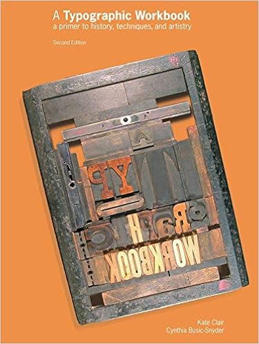
Week 7 : A Typographic Workbook, Second Edition ( by Kate Clair , Cynthia Busic -Snyder )

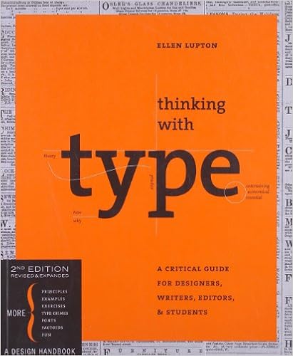
Week 8 : Thinking with Type ( by Ellen Lupton, 2004 )

In fifteenth-century Italy, humanist writers and scholars rejected gothic scripts in favor of the lettera antica, a classical mode of handwriting with wider, more open forms. The preference for lettera antica was part of the Renaissance (rebirth) of classical art and literature. Including the parts where they talk about how typography is used. They say stuff, and you're left wondering how any of it works or why it's significant. The author will tell you that some people use a certain grid system and show you a picture of said grid system. But they won't say why those people do it, or what the benefits and disadvantages are of that system compared to others. It's just like "Hey, this grid system exists, see look." This means there is very little practical information in the book.
Week 9 : The New Typography ( by Jan Tschichold )

" We do not need pretentious books for the wealthy we need more really well made ordinary books. "we should indeed design for today's technology rather than trying to force all that we can do today into yesterday's rigid confines. Tschichold argued in favor of standardized paper sizes and using photos in design. It's mind-boggling in our time to think those things were resisted when they were new. It was fun to read Tschichold's early ideas on book design, knowing that he would go on to change book design as we still know it today through his work at Penguin.


Comments
Post a Comment