Typography / Project 2b

19/06/2020 - 03/07/2020 / Week 10 - Week 12
Avery Ong Xuan Ting / 0344462
Typography / Bachelor of Design (Hons) in Creative Multimedia
Project 2b / Typography: Expression, Hierarchy and Composition
INSTRUCTION
Project 2b
- Express typographically a social message relevant to the campus community at Taylor’s University
- Set a margin. Create columns and rows.
- Choose an appropriate typeface from the 10 given (for love and hate respectively)
- Format the text while considering the point size, line length, alignment, ragging and tracking.
- Save as PDF, upload to G-Drive and embed into e-portfolio.
- Print out on A3.
Line Option:
I found three line that I think I can go with this project:
1. Wall of wisdom.
2. live a creative life.
3.Without change there'd be do butterflies.
After discussing with Mr. Shamsul, I decided to go with the third line which is more clear and easy to design.
Research:
After selecting the lines, I started to do some research from Pinterest.


fig. 2.0 ; Pinterest
Sketches:

fig. 2.1 ; sketch
Digitized:

fig. 2.2 ; first outcome

fig. 2.3 ; second outcome

fig. 2.4 ; third outcome
I have designed three poster and added some elements (butterflies) . Because Mr. Vinod and Mr. Shamsul suggested me to do more expression on the word ' change ', so my idea of these three design is to animate the word ' change ' changing colours.
I have send my outcome to Mr. Vinod to check. As the feedback he given, I think I should redesign another outcome to make it works better. Therefore, I do more research to find some inspiration.
Inspiration :


fig. 2.11 ; signboard

fig. 2.12 ; colour testing


 fig. 2.21 ; final outcome ; GIF
fig. 2.22 ; final outcome ; PDF
I have send my outcome to Mr. Vinod to check. As the feedback he given, I think I should redesign another outcome to make it works better. Therefore, I do more research to find some inspiration.
Inspiration :
fig. 2.5 ; Shillingtoneducation.com
fig. 2.6 ; by Stopdesign
After doing some research on Pinterest, I have more idea for my poster design. I digitized again in Indesign and create 6 margin and columns and guides to check the alignment. The typreface I have chosen for this project is Gill Sans Std.

fig. 2.7 ; forth outcome ; normal view

fig . 2.8 ; forth outcome ; preview
After designing the forth outcome, I tried using the same idea to create another different design with changing the position and rotate the word ' change '. I designed in Photoshop , so it comes out my fifth outcome.

fig. 2.9 ; fifth outcome
Although I had designed this two more outcome, but I still not excited with any of them. I don't think those design really work and fully show out the expression. So I tried another idea to emphasis and do more expression on the word ' change ' .

fig. 2.10 ; sixth outcome
I do some research for the NO signboard to make it represent better.
fig. 2.11 ; signboard
After editing the signboard and do some minor changes, I played with the colour to choose one that fix the expression. The first three designs I had increased the size bigger like what Mr. Vinod and Mr. Shamsul told to do so. However, I think it were too big so I added a border for the last three designs.

fig. 2.12 ; colour testing
I chose to go with the last design because I'm happy with its colour scheme. But we are not suggested to add a frame for the design, so I have to increase the size again to fix the artboard. I try to do more adjustment for the word 'change' to show out more expression.

fig. 2.13 ; trying more expression for 'change'
I sent this outcome to Mr.Vinod and he suggested me to forget about the no signboard design. Therefore, I type out the word 'no' and started to animate the poster.


fig. 2.14 ; chosen design for animation
I chose these two poster to start animating. I tried to animate in Illustrator and Photoshop.

fig. 2.15 ; first idea ; in Illustrator
My first idea to animate is to keep changing colour for each letters of the word 'change' , to express the word. There are six frames for this animation. After editing in Illustrator, I export it to Photoshop to animate it.

fig. 2.16 ; first idea ; in Photoshop

fig. 2.17 ; first outcome ; GIF
After the first idea had done, I started to animate my second idea in Illustrator too.

fig. 2.18 ; second idea ; in Illustrator
My second idea to animate was squeezing the word 'change' by using the Warp tool. Overall, There are 11 frames. After editing and saving, I export it to Photoshop again as usual.

fig. 2.19 ; second idea ; in Photoshop

fig. 2.20 ; second outcome ; GIF
After the feedback given, I readjust the part which Mr. Vinod had mentioned. Below are my final outcome.

fig. 2.22 ; final outcome ; PDF
FEEDBACK
Week 10 :
Specific feedback:
- Replicate it with yours to make it more attractive.
- Think about colour later.
- The form needs impact which it lacks presently.
- Think about colour later.
- The form needs impact which it lacks presently.
General feedback:
- Project 2A(P2A) / Final JPG Artwork from Ai; Poster must be exported 300dpi (Black and White) when uploading on e-portfolio.
- There must be 2 posts for P2A and P2B.
- Check all embedded files using dark mode/incognito/private browser to see if the files are visible.
- Name the posts properly.
- Project 2A(P2A) / Final JPG Artwork from Ai; Poster must be exported 300dpi (Black and White) when uploading on e-portfolio.
- There must be 2 posts for P2A and P2B.
- Check all embedded files using dark mode/incognito/private browser to see if the files are visible.
- Name the posts properly.
Week 11 :
Specific feedback:
- Work on the kerning.
- Show the change of colour for the word ' change '.
- Maintain the spacing.
- Increase the size and aligned it to the top or bottom.
- Replace the 'o' to the NO signboard and make it replicate better.
- Show the change of colour for the word ' change '.
- Maintain the spacing.
- Increase the size and aligned it to the top or bottom.
- Replace the 'o' to the NO signboard and make it replicate better.
General feedback:
- No general feedback has given this week.
Week 12 :
Specific feedback:
- Second outcome works better and fully expression.
- The spacing between the last two sentences is a bit different from the rest, adjust it if possible.
General feedback:
- No general feedback has given this week.
REFLECTION
Week 10 :
Reflections: I feel confidence while I had chosen the line for this project because I have many idea to design the poster. But after sketching out my idea, I found that it is lack of expression.
Observations: We should fully understand the meaning of the line before we choose it. Represent more expression with the keyword typographically.
Findings: We are not allowed to use too many graphic elements and Illustrations for this project because it is a typography class. We can use limited amount of elements only.
Week 11 :
Reflections: The keyword of the line I chosen was still lack of expression. I found that it was very difficult to show the expression typographically but I tried my best.
Observations: Not just have to design a poster that fully represent its expression, we should also plan which part of the word we are going to animate and the design is suitable for the animation.
Findings: To design and animate a great poster is not as easy as I thought. Although my design are still not presenting very well but I will try my best.
Week 12 :
Reflections: Finally, I'm happy with my final outcome. I had tried my best to express the keyword typographically. Meanwhile, I think I should feel more confident with my outcome because everyone have their own special idea for their design. No right or wrong.
Observations: Alignment is very important. I always forgot to check the spacing between every sentences. Therefore, if I want to make my final outcome perfect I have to readjust everything again and there will be more work to do.
Findings: This is the final project for this semester. I think it doesn't as difficult as I think before I start to do every project. The most important things to start a project is to do some research before sketching, fully expression the typography, choose a suitable typefaces and check the alignment.
FURTHER READING
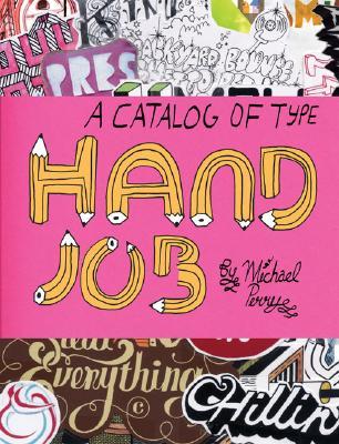
Week 10 : Hand Job : A Catalog of Type ( by Mike Perry )
Week 11 : Grid Systems: Principles of Organizing Type ( by Kimberly Elam )

Although grid systems are the foundation for almost all typographic design, they are often associated with rigid, formulaic solutions. However, the belief that all great design is nonetheless based on grid systems (even if only subverted ones) suggests that few designers truly understand the complexities and potential riches of grid composition.
In her best-selling Geometry of Design, Elam shows how proportion, symmetry, and other geometrical systems underlie many of the visual relationships that make for good design. Now, Elam brings the same keen eye and clear explanations to bear on the most prevalent, and maybe least understood, system of visual organization: the grid.
Filled with extensive research and more than 100 informative examples from the Bauhaus to Nike ads, Grid Systems provides a rich, easy-to-understand overview and demonstrates a step-by-step approach to typographic composition. It suggests design strategies that transcend simple function and reductionist recipes to allow grids to become a means of truly dynamic communication. Any designer, educator, or student will benefit greatly from this elegant slim book, chock-a-block full of colorful examples, helpful vellum overlays, and Elam's insightful analysis.
Week 12 : Grid Systems in Graphic Design /Raster Systeme Fur Die Visuele Gestaltung ( by Josef Müller-Brockmann )

Grid Systems in Graphic Design is a timeless classic that belongs on every designer and designer wannabee's bookshelf.
Ripe with visual examples, the book doesn't only provide you with a practical framework for design and layout for anything you might be working on (web, print, application development...), it goes the extra mile to explain in the perfect amount of detail why things affect their audience in particular ways, or why you should do things one way or another.
This book dissolves a lot of challenges one faces in layout work and eliminates confusion both for designers and the clients of their finished work. Things will inherently make more sense and the designer's workflow becomes simplified for the better while improving their work greatly.
If you create visual things for a living or for a hobby, you owe it to yourself to at least leaf through the book a couple times. Grid Systems in Graphic Design is fantastic and important reading material that can be enjoyed as a reading piece or as somewhat of a reference piece.
Week 12 :
Reflections: Finally, I'm happy with my final outcome. I had tried my best to express the keyword typographically. Meanwhile, I think I should feel more confident with my outcome because everyone have their own special idea for their design. No right or wrong.
Observations: Alignment is very important. I always forgot to check the spacing between every sentences. Therefore, if I want to make my final outcome perfect I have to readjust everything again and there will be more work to do.
Findings: This is the final project for this semester. I think it doesn't as difficult as I think before I start to do every project. The most important things to start a project is to do some research before sketching, fully expression the typography, choose a suitable typefaces and check the alignment.
FURTHER READING
Week 10 : Hand Job : A Catalog of Type ( by Mike Perry )
In this digital age of computer-generated graphics and typography, it's refreshing to find typographers who still believe in working by hand. No longer relegated to designer's sketchbooks, hand-drawn type has emerged from the underground as a dynamic vehicle for visual communication from magazine, book, and album covers to movie credits and NFL advertisements. As the practice and appreciation of hand-drawn type grows, its time to celebrate the work of those typographers whose every letterform is a work of art. Hand Job collects groundbreaking work from fifty of today's most talented typographers who draw by hand. Graphic designer and hand typographer Michael Perry selects work representing the full spectrum of design methods and styles. Each hand-drawn work is entirely shaped by the artist's unique process very one a carefully executed composition enhanced by unplanned "accidents" of line, color, and craft. Hand Job also includes photographs of found type, artists studios, and the tools that help make typography come to life. Whether you are looking to invigorate your design work or are just in need of a little offbeat inspiration, Hand Job will have you reaching for your favorite pen.
Week 11 : Grid Systems: Principles of Organizing Type ( by Kimberly Elam )
In her best-selling Geometry of Design, Elam shows how proportion, symmetry, and other geometrical systems underlie many of the visual relationships that make for good design. Now, Elam brings the same keen eye and clear explanations to bear on the most prevalent, and maybe least understood, system of visual organization: the grid.
Filled with extensive research and more than 100 informative examples from the Bauhaus to Nike ads, Grid Systems provides a rich, easy-to-understand overview and demonstrates a step-by-step approach to typographic composition. It suggests design strategies that transcend simple function and reductionist recipes to allow grids to become a means of truly dynamic communication. Any designer, educator, or student will benefit greatly from this elegant slim book, chock-a-block full of colorful examples, helpful vellum overlays, and Elam's insightful analysis.
Week 12 : Grid Systems in Graphic Design /Raster Systeme Fur Die Visuele Gestaltung ( by Josef Müller-Brockmann )

Ripe with visual examples, the book doesn't only provide you with a practical framework for design and layout for anything you might be working on (web, print, application development...), it goes the extra mile to explain in the perfect amount of detail why things affect their audience in particular ways, or why you should do things one way or another.
This book dissolves a lot of challenges one faces in layout work and eliminates confusion both for designers and the clients of their finished work. Things will inherently make more sense and the designer's workflow becomes simplified for the better while improving their work greatly.
If you create visual things for a living or for a hobby, you owe it to yourself to at least leaf through the book a couple times. Grid Systems in Graphic Design is fantastic and important reading material that can be enjoyed as a reading piece or as somewhat of a reference piece.


Comments
Post a Comment