Advanced Typography / Exercises
Avery Ong Xuan Ting / 0344462
Advanced Typography / Bachelor of Design (Hons) in Creative Multimedia
Exercises
LECTURES
Week 1 / Typographic Systems :
All design is based on a structural system and according to Elam 2007, there are eight major variations with an infinite number of permutations.
8 major typographic systems:
- Axial System
All elements are organized to the left or right of a single axis.
- Radial System
All elements are extended from a point of focus.

- Dilatational System
All elements expand from a central point in a circular fashion.

- Random System
Elements appear to have no specific pattern or relationship.

- Grid System
A system of vertical and horizontal divisions.
- Modular System
A series of non-objective elements that are constructed in as a standard units.

- Transitional System
An informal system of layered handing.

- Bilateral System
All text is arranged symmetrical on a single axis.
Week 2 / Briefing of Type & Play Exercise :
We were be asked to make a selection of image between man-made objects (chair, glass, etc.) or structures (buildings), and nature (Human, landscape, leaf, plant, bush, clouds, hill, river, etc) then analyse, dissect and identify potential letterforms within the dissected image. The forms would be explored and ultimately digitized. It is expected that through a process of iteration the forms would go from crude representation to a more refined celebration that would reflect to a degree its origins.
Week 3 / Briefing of Type and Image :
For this exercise, we have to design an image of a man-made structure or object and nature which combined with a letter/word/sentence. The objective must enhance the interplay between the
letter/word/sentence and the selected image. The text must be woven into a symbiotic relationship with the image.
INSTRUCIONS
Task 1:
Exercise ( Week 1 )
Typographic System
Explore the 8 typographic systems : Axial, Radial, Dilatational, Random, Grid, Modular,
Transitional and Bilateral using the following content.
The Design School,
Taylor’s University
All Ripped Up: Punk Influences on Design
or
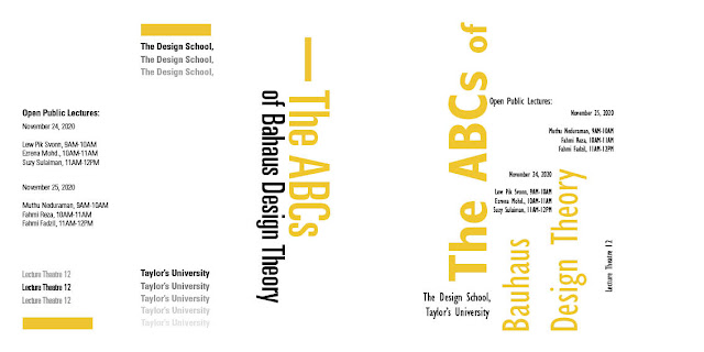
The ABCs of Bauhaus Design Theory
or
Russian Constructivism and Graphic Design
Open Public Lectures:
November 24, 2020
Lew Pik Svonn, 9AM-10AM
Ezrena Mohd., 10AM-11AM
Suzy Sulaiman, 11AM-12PM
November 25, 2020
Muthu Neduraman, 9AM-10AM
Fahmi Reza, 10AM-11AM
Fahmi Fadzil, 11AM-12PM
Lecture Theatre 12
The exploration of the various systems would ultimately be used as a basis for Project 1 and 2. Size 200 x 200 mm. In addition to black, you can use one other colour. Graphical elements (line, dot, etc.) can be used but limitedly. Only one topic should be picked.

fig. 1.0 ; Axial System ( first outcome )
fig. 1.1 ; Radial System ( first outcome )
fig. 1.2 ; Dilatational System ( first outcome )
fig. 1.3 ; Random System ( first outcome )
fig. 1.4 ; Grid System ( first outcome )
fig. 1.5 ; Modular System ( first outcome )
fig. 1.6 ; Transitional System ( first outcome )
fig. 1.7 ; Bilateral System ( first outcome )
After the feedback given by Mr.Vinod, I edit all the issues and minor changes again. Below is my final outcome.
fig. 1.8 ; Axial System ( final outcome )
fig. 1.9 ; Radial System ( final outcome )
fig. 1.10 ; Dilatational System ( final outcome )
fig. 1.11 ; Random System ( final outcome )
fig. 1.12 ; Grid System ( final outcome )
fig. 1.13 ; Modular System ( final outcome )
fig. 1.14 ; Transitional System ( final outcome )
fig. 1.15 ; Bilateral System ( final outcome )
fig. 1.16 ; final outcome ( pdf )
Task 2:
Exercise ( Week 2 )
Type & Play ( Part 1: Finding Type )
First, I look around my surrounding and took some pictures for this exercise.
fig. 2.1 Maggi mee
fig. 2.2 ; table
fig. 2.3 ; toilet bowl
fig. 2.4 ; curtain
I chose to go with the Maggi mee ( fig. 1.17 ) because I think it will be more easy to identify potential letterform compare with other. First, I edited the effect to black and white and choose the brighter part to create the outline.
fig. 2.5 ; edited effect
fig. 2.10 ; letter 'Y'
fig. 2.10 ; letter 'T'
fig. 2.11 ; dissected letters
I dissected the letters C,L,S,T,Y from the picture I chosen. Based on the Maggi, its characteristic are pretty curly and wavy. Therefore, I started to edit the letters aligned to the baseline and cap line I created.
fig. 2.12 ; first outcome
After the feedback given, I redo again to make it better.
fig. 2.13 ; progress of finding letters
fig. 2.14 ; dissected letters
fig. 2.15 ; adjusting the size
fig. 2.16 ; progress
fig. 2.17 ; first outcome
fig. 2.18 ; second outcome
fig. 2.19 ; third outcome
fig. 2.20 ; forth outcome
fig. 2.21 ; letter 'C' final outcome
fig. 2.22 ; letter 'L' final outcome
fig. 2.23 ; letter 'S' final outcome
fig. 2.24 ; letter 'U' final outcome
fig. 2.25 ; letter 'Y' final outcome
fig. 2.26 ; final outcome ( pdf )
fig. 3.1 ; progress
fig. 3.2 ; progress
fig. 3.3 ; first outcome
fig. 3.4 ; image selected for 'Dance'
fig. 3.5 ; progress
fig. 3.6 ; progress
fig. 3.7 ; second outcome
After the feedback given by Mr. Vinod, I thinks the second outcome work more interesting. As a result, I chose it as my final outcome.
fig. 3.8 ; outcome ( JPEG )
Mr. Vinod suggested me to adjust the curve of the skirt to make it more obvious. After adjusting and do some minor changes, below is my final outcome.
fig. 3.9 ; final outcome ( JPEG )
fig. 3.10 ; final outcome ( PDF )
FEEDBACK
Week 1 :
Specific feedback:
- Axial: (right) Shift a little bit to the right to make it balance.
- Radial: (left) The title is not working. For the propose of this exercise, try to minimize it. 'Lecture Theatre 12' is not focus on anything. (right) Make the position to 3/4 pt.
- Dilatational: (left) Take away one of the chat box because it was too symmetrical.
- Random: Need more random.
- Grid: (left) Check the alignment.
- Modular: Not related to this system, have to work it again.
- Transitional: Too much non objective elements ( black and white colour ) .
- Bilateral: (left) Align the stem of the first word. However, comma no need to be aligned. Rework the spacing and check the alignment. (right) Increase the size of ' Lecture Theatre 12 ' to be aligned. Check the kerning and letter spacing. The objective element doesn't work.
General feedback:
- When we work on layout, the most important thing is to check the alignment every time.
- The idea of this exercise is to depend on the positioning replacement and the use of different typefaces in the particular given space, The main emphasis should not be colour and shapes.
Week 2 :
Specific feedback:
- The way I dissected the artwork not really accurate.
- The artwork not actually based like what it actually looks like.
- Need to rework again.
- Introduce the point at the suitable place.
General feedback:
- Inform lecturer after we had adjust our original assessment because the mark will not staying the same.
Week 3 :
Specific feedback:
- The spine of the S needs to be a little even, presently the thick and thin areas aren’t even, refer to existing type (Gill sans / Univers).
- Letter Y left diagonal stroke serif looks slightly different from right, maybe it should be the same.
General feedback:
No feedback given.
REFLECTIONS
Week 1 :
Experience: Today is the first week of the class. I'm very excited to this new semester. However, I thought we still have to stay online for this semester therefore I will plan to go back to campus next week.
Observations: For the first week exercise we have to be very mindful for every detail. I understand better after doing some research.
Findings: I'm looking forward for the next week face-to-face class in campus. Before that, I will try my best to finish the exercises that given by this week.
Week 2 :
Experience: Today is the first time I attended Typography class in campus. I don't think there is much different with online classes.
Observations: It was a little bit difficult to heard the feedback Mr. Vinod given clearly. Glad that everything was recorded in Facebook live so I could listen back to what he said.
Findings: Some of my design wasn't related to the required system. I still a little bit confuse with Modular System and Transitional System. We must be very self-discipline and manage our time to finish all the exercises that given every week.
Week 3 :
Experience: Sometimes my computer was lagging while lecturer was giving the feedback but glad that it was all recorded in Facebook live so that I can listen again to the given feedback.
Observations: We must get ready to share our screen for the lecturer to check the work before our turn because we are wasting other people's time for them to get their feedback.
Findings: We should listen to our feedback clearly and jot down the note so that we can edit our exercise to make it work well.
FURTHER READING
Week 1 : 7 Essential Typographic Layout Systems ( by Lucas Czarnecki )
I try to find a book that related to this week exercise to gain theoretical and practical knowledge in Advanced Typography.
Modular system: usually people associate modular layouts with the grid; while they go together very well, no one is forcing you to use a grid here. Modular layouts use repeating structures to break up the content.
These structures can be basically anything: shapes are the most common.
Use circles for your modules. You can type inside the circles, or use a series of radial designs or dilatational designs. Try placing your content into squares. It might look like a grid, and that’s okay. You can make the squares any size you want and arrange them in any way you want. Seriously, try things out.
You can make your modules out of pretty much anything. Any shape, any layout, anything. They’re really mini compositions that come together to make a larger composition.
Week 2 : Typographic System of Design ( by Kimberly Elam )

Typographic organization has always been a complex system in that there are so many elements at play, such as hierarchy, order of reading, legibility, and contrast. In Typographic Systems, Kim Elam, author of our bestselling books, Geometry of Design and Grid Systems, explores eight major structural frameworks beyond the grid including random, radial, modular, and bilateral systems. By taking the reader through exercises, student work, and professional examples, Elam offers a broad range of design solutions.
Once essential visual organization systems are understood the designer can fluidly organize words or images within a structure, combination of structures, or a variation of a structure. With clarity and substance, each system from the structured axis to the nonhierarchical radial analysis explained and explored so that the reader comes away with a better understanding of these intricate complex arrangements.
Week 3 : The Typography Idea Book : Inspiration From 50 Masters ( by Heller, Steven Anderson, Gail )
The follow up to "The Graphic Design Idea Book,” (the yellow one) Steven Heller & Gail Anderson have put together another great inspirational guide (the red one) to help creative blocks or bolster smart conceptual thinking. Similar in format, design (cover by Pentagram) and page count, it’s also full of brilliant examples demonstrating the power and diversity of typography in action.
An easy guide of ideas using letters of all languages (not limited to English alone) is well-delivered in a short and sweet book that encourages the reader to spend time with it thoughtfully. Described as “Inspiration from 50 Masters,” much is covered here; fundamental design themes of dimension, transformation and layering to more complex ones like abstraction, collage & expressive reduction. Part typographic design history lesson, part mentor in a book, part light inspirational reading, this is worthy as a creative resource regardless of whether you are a longtime professional or just getting started.


Comments
Post a Comment