Advanced Typography / Project 1A
Avery Ong Xuan Ting / 0344462
Advanced Typography / Bachelor of Design (Hons) in Creative Multimedia
Project 1A / Key artwork
LECTURES
Week 4 :
No lecture given due to public holiday.
Week 5 / Feedback & Progression :
Mr. Vinod give everyone feedbacks for their work progression. No lecture was given.
Week 6 / Feedback :
Mr. Vinod give everyone feedbacks for their work progression. After our artwork was proved, we need to began to start designing the poster.
INSTRUCTION
Project 1 ( Week 4 )
This project are tasked to create a key artwork to be used in collateral for the subsequent task down the line. We must use visual elements or graphical elements and the title (type) in an experimentative, impactful and visually attractive manner.
The three event titles topics:
- All Ripped Up: Punk Influences on Design
- The ABCs of Bauhaus Design Theory
- Russian Constructivism and Graphic Design
Research
The topic I chosen for this project was: The ABC's of Bauhaus Design Theory. First of all, I do some research before I started to design.
The ABC's of the Bauhaus is, "a collection of visually and intellectually stimulating essays about basic design courses at the Bauhaus, Froebel toys, inflation in the Weimar Republic, the typography of Herbert Bayer, Psychoanalysis, and fractal geometry. A fascinating fantasia on an elementary theme."
fig. 1.0 ; research
Reference
I find some references from Pinterest that related to this topic.
fig. 1.1 ; reference
fig. 1.2 ; reference
After the research, I started to do a roughly sketches for my idea. I came out with four ideas which I think related to the topic I chosen, which is : The ABC's of Bauhaus Design Theory.
fig. 1.3 ; sketches
fig. 1.4 ; sketches
Progress
I started to design my first idea in InDesign. I created margin and column and grids to make it tidy and clean. The typeface I chosen was Gill Sans Std.
fig. 1.5 ; progress in InDesign
After this, I copy and pasted to Illustration to continue my design because I felt that InDesign was a little bit difficult for me to design my artwork. However, I added some colours and adjust the letters to fit the boxes.
fig. 1.6 ; progress in Illustration
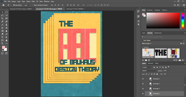
I downloaded some texture to edit into the design but Illustration couldn't work with it. Therefore, I copy and pasted to Photoshop again to continue with the idea.

fig. 1.7 ; progress in Photoshop

fig. 1.8 ; first outcome

fig. 1.9 ; progress in Photoshop

fig. 1.10 ; second outcome
Furthermore, I tried to design an artwork with geometric shapes. I played with the shape in Illustration using Pathfinder.

fig. 1.11 ; progress in Illustration
I think it's a little bit difficult to design in Illustration because some of the tool I still not use to it yet. So I move again, copy and paste in Photoshop to continue with the design.
fig. 1.12 ; progress in Photoshop
fig. 1.13 ; third outcome
After receiving the feedback given by Mr. Vinod, I tried a black and white version but I don't think it really works. Below is the black and white outcome .
fig. 1.14 ; black and white version
Therefore, I chose the second outcome as my final outcome. I edited the background colour to white colour as Mr. Vinod suggested to do. As a result, this is my final outcome.
fig. 1.15 ; final outcome
fig. 1.16 ; first outcome ( black and white )
After doing some minor changes, below was my final outcome of black and white version. I'm very happy with it.
fig. 1.17 ; final outcome ( black and white )
fig. 1.18 ; final outcome (pdf)
FEEDBACK
Week 4 :
Specific feedback:
- ( first outcome ) We are not allowed to stretch the typeface.
- ( second outcome ) Remove the background or change the colour. Overall was good.
- ( third outcome ) Not working at all. This design more to graphic design.
General feedback:
- Second outcome works well. Try to design a black and white version.
Week 5 :
Specific feedback:
- Black and white version doesn't work.
- Remove the black background and create an outline for the paper.
- Check the outline of the letter 'ABC' .
General feedback:
- Make sure the design was related to the title meaning.
REFLECTIONS
Week 4 :
Experience: At first, I thought we have to design a poster for this project. After showing my friends my design outcomes, they told me that I might need to redesign again. But I didn't expect that Mr. Vinod accepted one of my outcome, give me motivation to move on.
Observations: We should start with a black and white version first every time we begin to design. After we thinks every elements and words work well, then we only start to add in some colours that match the design.
Findings: Next time I need to be very mindful and read the MIB in detailed before start doing the work. I'm just a little bit lucky this time because my design was similar to key artwork.
Week 5 :
Experience: At first I have no idea how to convert my artwork to black and white version. After trying many times, the black and white version still didn't work. I gave up on trying and show Mr. Vinod the unhappy version. But finally, I was excited with the final outcome.
Observations: Mr. Vinod told me I can't convert it exactly from the colour version but I misunderstood the meaning. That's the reason why my black and white version doesn't work. He gave me some instructions on how to convert it therefore I only understand.
Findings: I think color schemes is very important for every design. Color schemes are very valuable when trying to express yourself in a harmonious painting.
FURTHER READING
Typography Essentials : 100 Design Principles for Working with Type ( by Saltz, Ina )
“Typography Essentials” is a delightful and distinctive guide to the foundations of typography. This book succinctly describes the multifaceted mechanisms of typography as a dynamic means of communication. What sets this book apart from others is that each type rule is specifically demonstrated by several inspiring design examples that were created by many of the most important designers in the field of communications and new media. This book has lots of great tips that are brilliantly explained and the amazing selection of examples used to demonstrate good use of typography definitely makes it a good book to keep around for inspiration. An incredible resource for designers and type-curious people from Ina Saltz, one of the foremost and most beloved authorities on the subject. The book is thusly well designed for comprehension—as well as simply being beautiful.


Comments
Post a Comment