Project 2 / Exploration & Application
Avery Ong Xuan Ting / 0344462
Advanced Typography / Bachelor of Design (Hons) in Creative Multimedia
Project 2 / Exploration & Application
INSTRUCTION
Project 2
Project 2
With the knowledge and experience gained, we should synthesize and apply the learning in the task to be mentioned, allow the knowledge gained to guide and inform your decisions for the effective execution of project 2. Develop a font that is intended to solve a larger problem or meant to be part of a solution in the area of our interest be it graphic design, animation, new media or entertainment design or any other related area not necessarily reflecting our specialization.
or
Explore the use of typeface in our area of interest, understand its existing relationship, identify areas that could be improved upon, explore possible solutions or combinations that may add value to the existing typeface. To be effective we will need to study your area of interest, look at how type is used in the area and identify potential weaknesses or possible areas of further exploration. We can then attempt to provide a creative solution or add value to an existing use.
The end outcome could be a designed font and its application in the form or format that it is intending to provide a solution for, or an exploratory process that solves a problem or adds value to an existing use. The work can manifest into any kind of format related to the issue being solved or explored: animation, 3d, print, ambient, projection, movie title or game title, use of different material etc.
Ideation ( Week 9 )
fig. 1.0 ; ideas proposal
Research ( Week 10 )
After the discussion with M. Vinod, I decided to go with the second idea. First of all, I do a research of the typeface before I start to design.
fig. 1.1 ; Stussy logo
The company founder, Shawn Stussy (born 1954), was a Californian manufacturer of surfboards. The logo which has defined the brand started in the early 1980s after he began scrawling his surname on his handcrafted surfboards with a broad tipped marker. A stylized "s" called the "Cool S", resembling a Möbius strip, is often mistakenly attributed to the brand.
There is no typeface founded for this logo but there is a typeface named as 'Stussy Script'. Stussy Script font is decorative font that featuring a stylish appearance which you will never see in any other typeface, designed by Kitch22 in 9th November 2011.
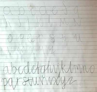
I found some script typeface as a reference before designing the typeface.
fig. 1.3 ; first reference
fig. 1.4 ; second reference
fig. 1.5 ; third reference
Progress
I decided to go with small capital letter and started to design in Illustration. I was trying to design it to slight to another side. I roughly sketch out my idea first before I start to design in Illustration.
fig. 1.6 ; sketch
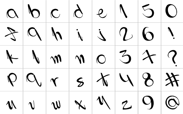
As a result, below are my first outcome :
fig. 1.7 ; first outcome
After getting feedback from Mr. Vinod, I edited the stroke as what he had mentioned. After that, I started to design numbers and some symbols.
fig. 1.8 ; second outcome (with guide)
fig. 1.9 ; second outcome (without guide)
Therefore, this is my third outcome but I'm not very happy with it. I didn't plan to generate out my font because it was a typeface for design, it won't use to type out something. But Mr. Vinod said that everyone need to generate out the font and put the link in the blog, so I tried to copy and paste it to Font Lab.

fig. 1.11 ; third outcome
Week 12 :
I don't think my font works well in Font Lab. Therefore, I found that it was quite difficult to make it all looks balance. This really took many time for me to adjust the minor issues until I feel that it works better. As a result, this is my final outcome.fig. 1.12 ; final outcome (Jpg)
fig. 1.13 ; final outcome (pdf)
Generate Font ( Week 13 )
After reediting many times, finally I'm quite happy with my outcome. Afterwards, I copy and paste into Font Lab to generate out my font and named my font as Stussy Scripy.
fig. 1.14 ; preview in Font Lab (alphabet)
fig. 1.15 ; preview in Font Lab (number)
fig. 1.16 ; generated font ; Stussy Scipy.ttf
Collateral
I start to design the collateral using my typeface in shirt, poster, phone case and other something special.
fig. 1.17 ; first outcome
After receiving the feedback given by Mr. Vinod, I redesign some of my collateral which he said that was not working. Besides that, I planned to design shirt, poster, skateboard and maintain the phone case design. As a result, below are my final outcome.
fig. 1.18 ; poster #1 ; final outcome (Jpeg)
fig. 1.19 ; poster #2 ; final outcome (Jpeg)
fig. 1.20 ; poster #3 ; final outcome (Jpeg)
fig. 1.21 ; skateboard #1 ; final outcome (Jpeg)
fig. 1.22 ; skateboard #2 ; final outcome (Jpeg)
fig. 1.23 ; T-shirt ; final outcome (Jpeg)
fig. 1.24 ; phone case ; final outcome (Jpeg)
fig. 1.25 ; Flat lay of collateral design (Jpeg)
fig. 1.26 ; Flat lay of collateral design (pdf)
FEEDBACK
Week 9 :
Specific feedback:
- I should be more clear about my first idea.
- For the second idea, the stroke I don't have to follow exactly as the logo.
- Adjust the stroke to make it slightly better.
General feedback:
- Second idea is doable.
- Find a script typeface as a reference, then analyze and dissect it.
Week 10 :
Specific feedback:
- My font's stroke should be a little bit thicker like the Stussy logo.
- The stroke either maintain the same as the logo or make it different.
General feedback:
- I can maintain the slant because it works.
Week 11 :
Specific feedback:
- Adjust the number 8, the stoke was too thin.
General feedback:
- No problem for the typeface, start to work on the collateral.
- The collateral need to design to promote out the typeface well.
Week 12 :
Specific feedback:
- The shirt is not working.
- Phone case can work but it didn't really promote out the font.
- I can design more poster to promote my font.
- The brand 'Stussy' should be smaller than my typeface.
General feedback:
- Make sure all the blog we can done before next week.
- Next week is the deadline for all the blog and designed thing.
REFLECTIONS
Week 9 :
Experience: I was quite excited because I'm going to design my own typeface which using Stussy as a reference. I think the font design is quite special, wish I could design a typeface that can works well.
Observations: I found that design a script typeface wasn't an easy things to do. I've face a lot of issues while designing the typeface and the most important is, I'm not really familiar with Illustration.
Findings: After doing some research, I found that there was many amazing script typeface in the world. I felt a bit stress because I'm afraid that my typeface wasn't as good as those typeface.
Week 10 :
Experience: I should listen properly what Mr. Vinod had told us while he is giving us the feedback. Sometimes I will only listen some sentence and misunderstood what Mr. Vinod has said. The best way to avoid this will happen again is to listen to the feedback again more than one time.
Observations: For me, Illustration is really difficult to use. I tried to adjust the stroke like the reference size but it couldn't work well. It took a lot of time for me to adjusting the stroke.
Findings: I should measure the angle before I start to create the font. I wanted to design a typeface that slant another side because I wanted to make it special instead of same like the Italic style. Unfortunately, I found that some of my alphabet wasn't slant the same angle as other after I design all the alphabet. This took a lot of time for me to reedit.
Week 11 :
Experience: I started to use my typeface to design some collaterals. I planned to applicate it on poster, shirt, phone case and ear rings. At first, I didn't planned to generate out my font because I thought it was optional and my font is to enhance some design only.
Observations: Actually, I'm not happy with my outcome. I redesign and reedit it many times but I couldn't find a way to solve the problem. I don't know which part not perfect enough and why it is look weird.
Findings: I still moving on to design the collateral because there are not enough time for me to redesign and readjusting it again and again. Mr. Vinod didn't mentioned anything thing to change instead of the stroke so I think I can move on schedule.
Week 12 :
Experience: I tried to generate the font in Font Lab but when I copy and paste into it, the stroke couldn't work well. Finally, I redesign all my font again so that I have motivation to move on because last week I was quite stress that my outcome wasn't what I had expected for.
Observations: After redesigning my typeface, I was more happy than before. Although it wasn't good enough compare to other but it looks better now. I took a lot of time to redesign and study the font and finally I'm confident enough to generate out the font and named it as 'Stussy Scripy'.
Findings: Although I wasn't the best student in class but I must always be confident with my design. Because when I bring myself down, I found that everything I have done couldn't work well.
FURTHER READING
How to Design a Typeface ( by Elizabeth Wilhide )
This is an attractive small book that doesn't deliver what its title advertises. The closest it comes to addressing its mission is with an interview with Jonathan Barnbrook and Marcus Leis Allison at the end. Much of the conversation is about the designers' interest in the history of type, which has inspired some of their creations. The reader may judge the quality of the latter from the short portfolio of their work in the closing pages of the book, but during their brief interview the pair of designers display profound ignorance about the former, i.e. the history of letterforms. Two examples:
-- "Black-letter fonts" are twice said to be associated with with Nazism and "fascism in general." Perhaps English people believe this to be the case, but in fact Fraktur was in wide use in Germanophone typography throughout the 19th and early 20th Centuries, even for the most benign literature. Moreover, from 1941 use of Fraktur in Nazi-controlled territories was banned on Hitler's order, because he'd heard (erroneously) that the typeface had been designed by a Jew. (See Philipp Luidl, "Die Schwabacher: Die ungewöhnlichen Wege der Schwabacher Judenletter" (2003).)
-- The pair also mention that Barnbrook's design of some letters in his "A Priori" font, particularly upper case 'A,' was influenced by "Cyrillic script," which had "influenced him over the years." ('Script' here is used in the sense of 'alphabet,' particularly the block-letter or printed form, not cursive writing.) The letter in question has the bar dropped so as to form something like a triangle. But instead of the Cyrillic 'A' the letter resembles the Greek 'Δ' from which the Cyrillic 'Д' derives -- and anyway both of those letters represent 'D.'


Comments
Post a Comment